
- Colours
- Navigation
- Using White Spaces
- Consistency
- Fonts and Images
- Less is More
For many businesses, creating a website is paramount to be successful in 2021. Having an online presence can maximise outreach for businesses in different industries. However, not all websites are created equal, it is important to know how to create an attractive website.
Websites are fundamental to the success of any business, not having one could prove to be a huge competitive disadvantage, whether it is a restaurant, retail, or anything else.
In this blog, we will explain how to create an attractive website.
Introduction
Aesthetically appealing websites often share a few key principles. They often follow details such as white spaces and minimalism to create a positive user experience. Attractive websites draw valuable traffic and find more people who will interact with the business.
If you want to attract traffic to your website and keep the visitors engaged, it is important to create an attractive website design. Making a visually pleasing and easy-to-use website design will keep users engaged on your page as well as draw new visitors to the website.
Data suggests 38% of people will stop engaging with a website if the content or layout is unattractive. This statistic highlights the importance of creating an attractive website. Having an unattractive website can cost a business to lose web traffic and by extension, lose potential revenue.
Professional web developers can help businesses create an appealing website boosting your web traffic and improving your brand image.
1) Colours
When creating an attractive website, you should pick a base colour that matches the theme of your entire business and use it throughout the website. It is also strongly recommended to have a strong accent and secondary colour for important elements, such as buttons and links, on the web page. Designers should be careful when choosing colours. There should be a focus on colours that are easy and comforting to the eyes and naturally complement the brand’s colours.
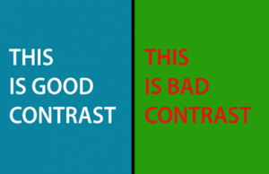
Fig.1. Good vs Bad contrast
It is difficult for some designers to choose colours that go well with each other. Having a website with bad contrast can be annoying to web users and make them leave the website instantly. The image shows the same font with different colours and backgrounds. The lighter text is easy on the eye whereas the darker red colour is harsher.
A website should be easy to navigate for visitors so that they can quickly find what they are for. For example, providing a search function and navigation menu buttons, and tabs. Without easy navigation, a website can look inconsistent. Having easy-to-use navigation is a way to ensure that visitors will spend more time exploring your website. This will help grow a business’s overall online presence.
It is difficult for some designers to choose colours that go well with each other. Having a website with bad contrast can be annoying to web users and make them leave the website instantly. The image shows the same font with different colours and backgrounds. The lighter text is easy on the eye whereas the darker red colour is harsher.
It is also worth remembering that most visitors will find your website through a search engine and therefore may not land at the homepage. So, each page viewed on its own should make it clear where the user is.

3) Utilising White Space
White space is simply empty space on a page. The white space does not necessarily have to be white; it just needs to be space without designs, text, or images. If used correctly, it will significantly improve user experience by removing clutter and increasing the focus of users on content. Web developers love using white spaces because they can help create grouping, add emphasis on UI elements, and improve readability.
White space can be any colour, although it is often white, as it refers to the background of the web design. You can make elements stand out by adding white space around them thus improving the effectiveness of content on your website.
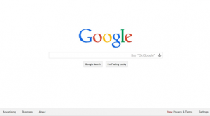
Fig.2. Google.com is an example of a webpage that utilises white spaces effectively. The majority of the page is covered in an empty space and there is a focus on the logo and search bar in the centre of the page.
4) Consistency
Consistency should be maintained throughout a website. When a visitor is navigating from one page to another, they should always know where they are and how to get back to where they started. Continuity and consistency are one of the most important elements in web designs. When a user clicks to navigate to a new page, that page should meet their expectations by delivering a consistent font, colour theme and structure.
Following a structure and maintaining consistency will help create a visually pleasing and attractive website. An inconsistent layout means that each webpage presses the visitor to stop and relearn how to use the website which isn’t ideal.
5) Fonts, Videos and Images
Fonts, videos, and images can contribute significantly towards creating an attractive website. Not only does the content on the web page matter, but it is also equally important for the target audience to be able to easily read the text and view images.
Ensure all aspects of your website are appealing and easy on the eye. Confirm all fonts and images work well together and make certain you use the appropriate font styles in the correct places for example, headings, subheading, etc.
Images bring instant visual appeal, style, and value to a website. However, you should try to avoid “stock images”. Stock images can look inauthentic and spoil the aesthetic of a website, so it is especially important to use high-quality images.
6) Less is More
Finally, a website needs to be simple, intuitive, and easy to use. As a general rule of thumb, the more minimalistic your website layout, the better. However, this does not mean it has to be plain and boring, but it does mean it should focus on the essential elements. Having a clean, easy-to-use, and practical layout will make your website easier to learn, navigate, and use on different devices.
What to remember
- Use White Spaces
- Have a Minimalistic Layout
- Consistent fonts
- Matching colours and themes
- Less is more
- Make navigation easy
- Use pictures and videos
Conclusion
At the end of the day, no one template can be used for every website as each one has a different purpose. However, there are a few key details that make certain websites more appealing than others and businesses should look to follow this guide to maintain a competitive edge.
Consistency is also an important factor in creating an attractive website. It can help visitors understand the website quickly and avoid having to relearn how to use the website while being visually pleasing at the same time. The combination of each of these elements can help create an attractive website, building an online presence and improve your brand.
Creating an attractive website starts with a solid design and a thought-out colour scheme. A colour wheel can be used to see which colours complement each other. Pictures, graphics, and fonts have to fit together on a webpage. This helps build trust with visitors who can see real images of the business, its staff and products and services offered.